Project Title
More detailed description here.
Highlights
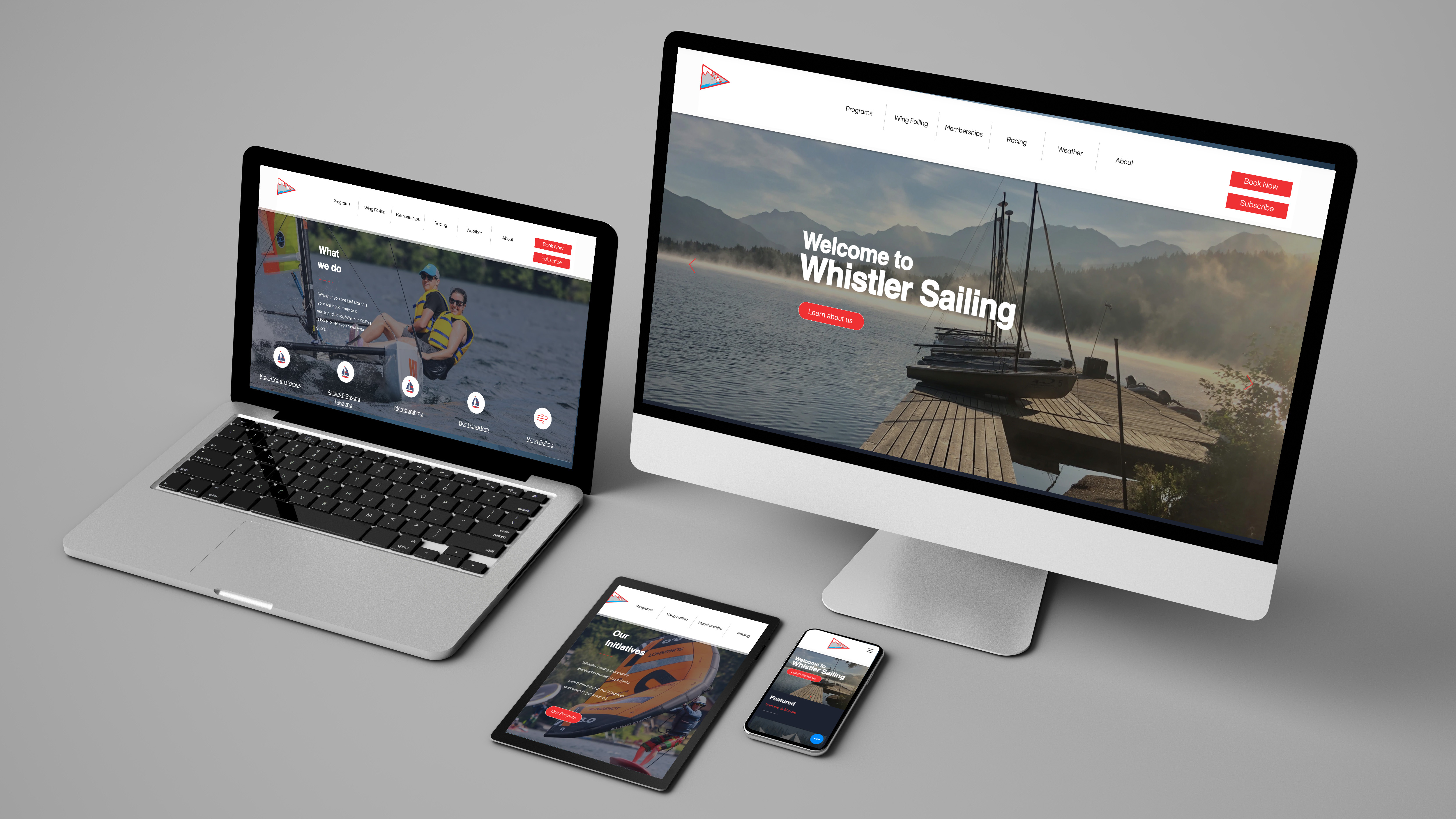
In 2022, the Whistler Sailing Association launched an exciting two-phase initiative to modernize its digital presence. With a hired contractor, the first goal was to deliver a clean website that would serve as a reliable hub for program information, events, and membership details. The second was more ambitious: to integrate a customized online booking system that would simplify registration and reduce administrative workload. While Phase 1 was completed successfully, Phase 2 marked a dramatic shift.
The booking system—intended to streamline operations—quickly began to unravel. Despite early optimism, the developer failed to deliver a usable product. As bugs, gaps, and inefficiencies mounted, the project consumed its budget and strained internal capacity. Families grew frustrated with registration and payment issues, while staff were pulled into hours of manual troubleshooting. The very tool meant to strengthen the organization had instead become its greatest liability.
Confronted with a system in collapse, I stepped in to take decisive action. After reviewing the technical, financial, and operational implications, I made the call to halt development entirely. Rather than continue investing in an unstable product, I led a strategic pivot: rebuilding the site from the ground up and rethinking the solution with clarity and focus.
I delivered a new site using WIX, one which gave the organization digital independence, and implemented Checkfront, a robust, user-friendly third-party booking platform that aligned with the real operational needs. The system allowed for quick rollout of features including lesson registration, membership payments, and boat rentals without the ongoing costs and risks of custom development. It was intuitive for staff, reliable for users, and sustainable for the organization.
The outcome was immediate and measurable: registrations became frictionless, administrative workload dropped significantly, and user satisfaction rose. The community responded with positive feedback, and the internal team regained confidence in managing digital tools. What began as a derailed project became a compelling example of adaptive leadership and strategic recovery.
This experience reinforced several lasting lessons for me:
- Simplicity scales. A lean, well-matched solution often outperforms custom builds when time, budget, and resources are limited.
- Do your reference checks. Past experience is a critical indicator, taking time to thoroughly vet vendors and developers can prevent costly setbacks. Don't pay to be someone's practice project by funding a learning curve with your own time, budget, and reputation.
- Choose aligned partners. Work with people who share your values, not just your contract. Partners should be invested in your success, and recommend what’s truly best for your organization.
- Build for sustainability. Tools should empower teams long-term, not lock them into external dependency.
- Adaptability is a superpower. When plans collapse, a well-informed pivot can turn failure into lasting success.
- See it in action at whistlersailing.com
Website Administration & Management
I oversee and maintain the Whistler Sailing website to ensure timely updates, accurate program information, and a seamless, user-friendly experience for the community.
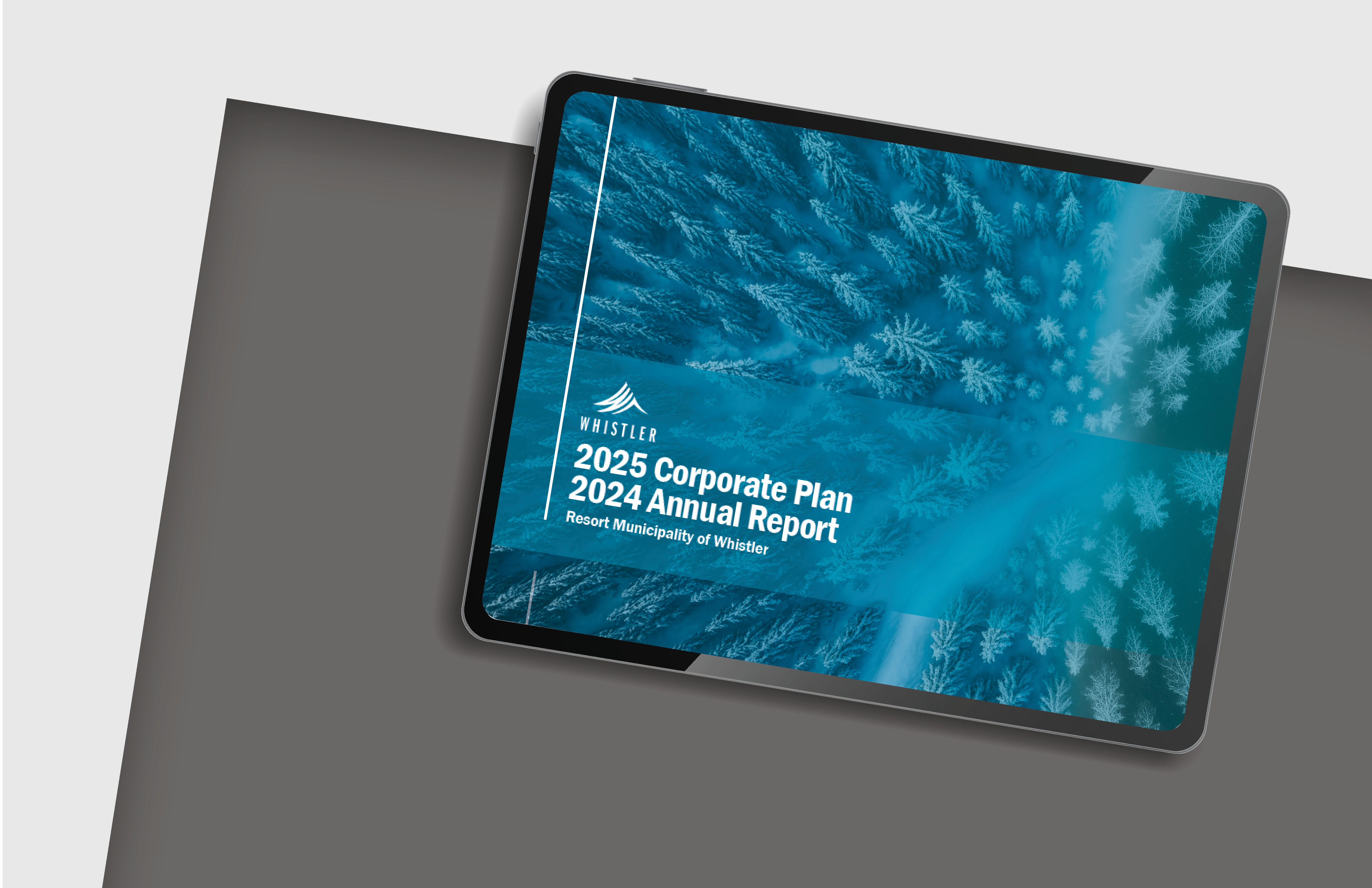
Every year, the Resort Municipality of Whistler (RMOW) produces a comprehensive Corporate Plan and Annual Report to outline its strategic priorities, key performance indicators, and departmental achievements. Given its importance as both a public-facing and internal planning document, it needs to be clear, visually engaging, and reflective of the community’s identity.
I’ve been responsible for designing this report annually for several years. Each year, I collaborate with internal departments to gather content, understand evolving priorities, and ensure the design reflects both current municipal goals and the established RMOW brand.
I apply consistent typographic hierarchy and visual structure to make the report easy to navigate, while also updating elements year over year to keep the design fresh.
For the 2025 edition, I was inspired by the intersection of our increasingly digital world and Whistler’s deep connection to nature. To represent this balance, I integrated stylized generated wireframe animal illustrations throughout the report—symbols of local wildlife rendered in a modern, geometric form. These visuals bridged the organic and the digital, subtly reinforcing RMOW’s vision of progress rooted in environmental stewardship.
The finished Corporate Plan was delivered on schedule and well-received by Council and staff. It continues to serve as a key resource for both strategic reference and public communication, and my ongoing involvement each year has helped maintain a consistent, high-quality standard for this critical municipal document.
See it live at whistler.ca/corporateplan
Corporate Communications Design
Designing impactful municipal reports that translate strategic direction into visually engaging documents—balancing data, narrative, and brand consistency to support clear and effective public communication.
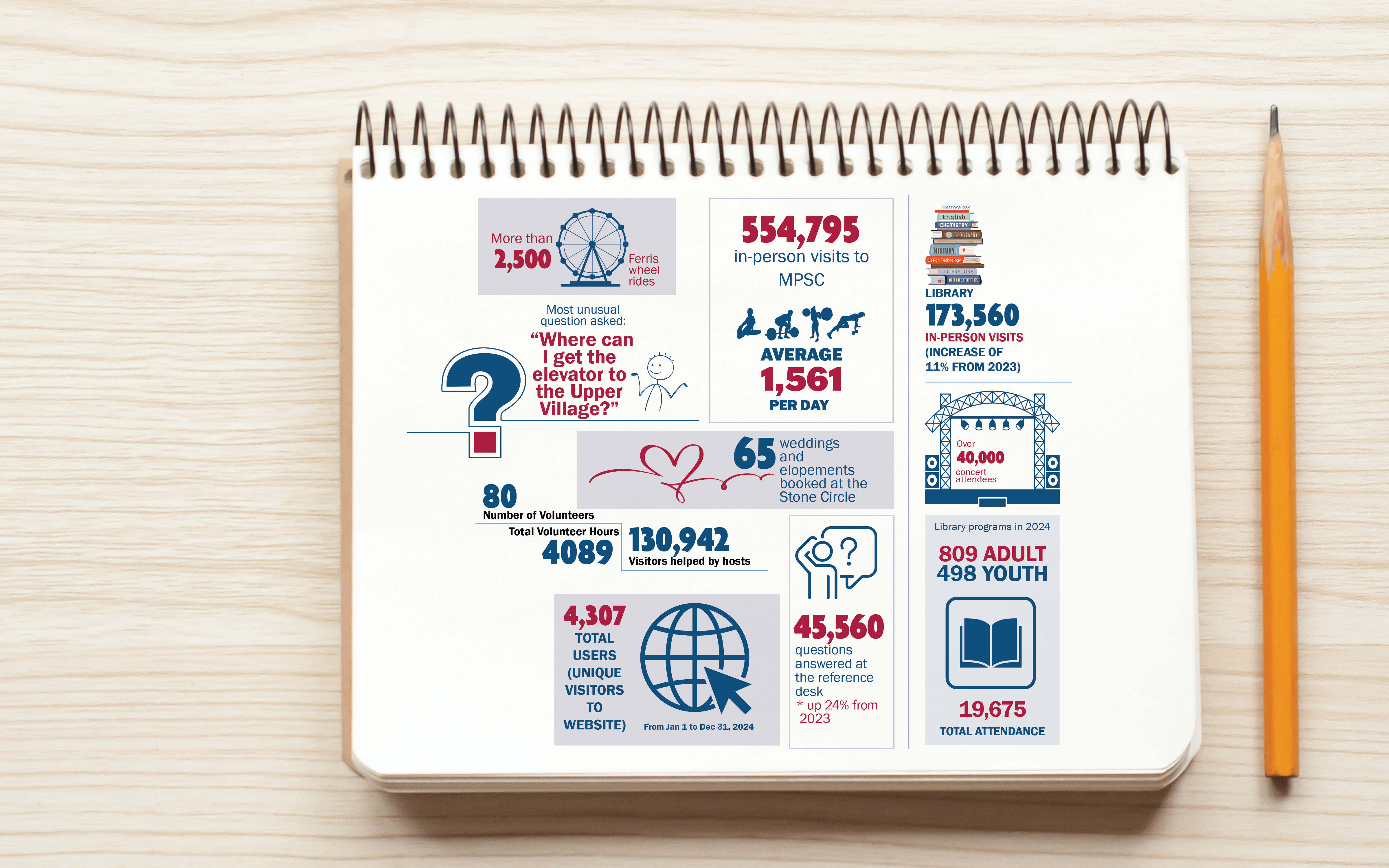
As part of the Resort Municipality of Whistler’s Corporate Plan update, I was tasked with showing how key strategic initiatives had progressed over the previous year. The challenge was to present municipal data—typically buried in spreadsheets and reports—in a format the community could quickly understand and connect with.
I was responsible for designing a visual snippet that would communicate this progress clearly and effectively. The goal was to turn raw statistics into a visual snapshot of municipal achievements.
The final design snippet successfully distilled a year’s worth of progress into a one-glance visual, making it easier for the public, stakeholders, and Council to see the tangible impact of their initiatives. It was used in both internal presentations and public-facing materials, helping reinforce transparency and build trust through design.
Data Visualization Design
Translating complex information into clear visual communication.
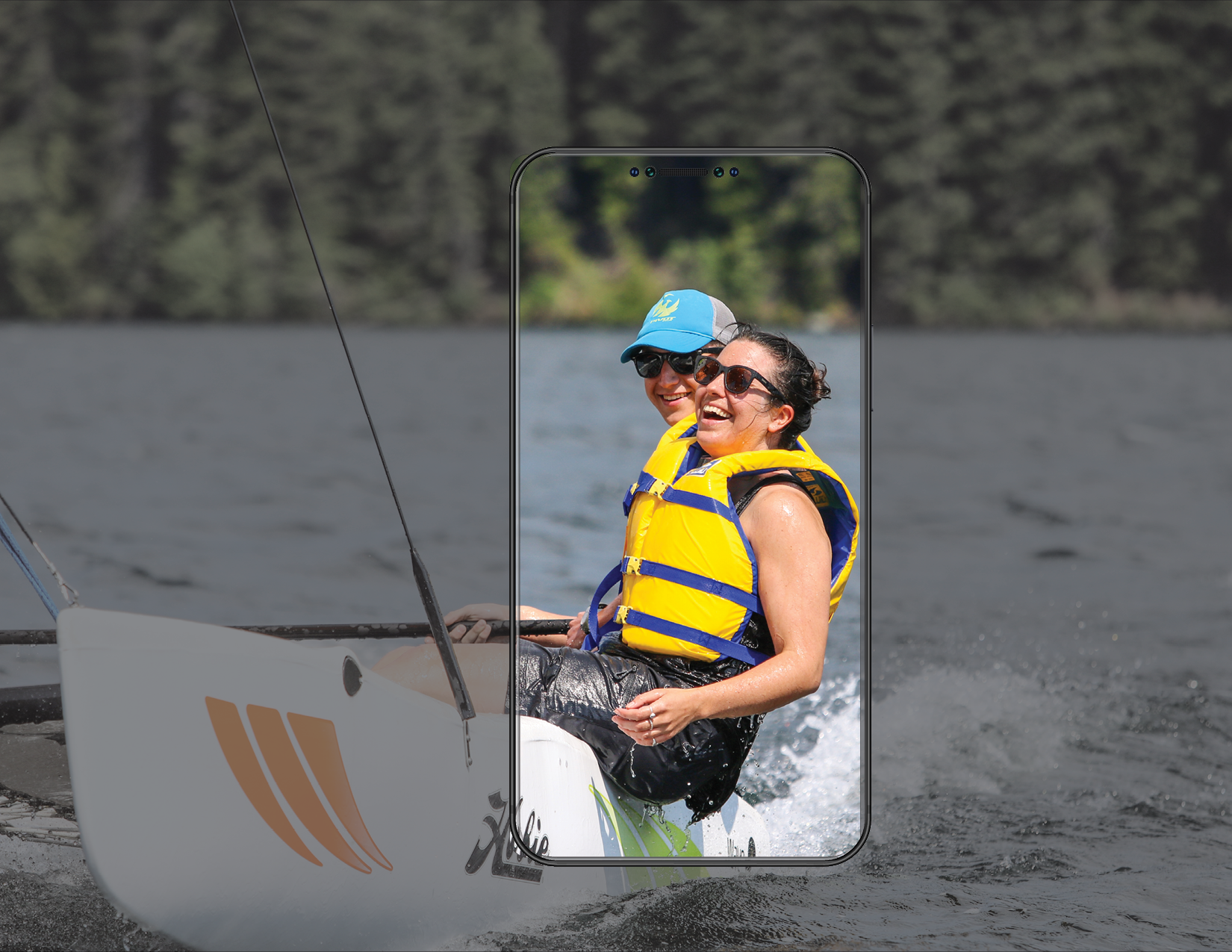
As Whistler Sailing’s official photographer, I’ve had the opportunity to capture the unique energy and spirit of life on the water. The team needed a consistent visual presence that could authentically reflect the excitement of the sport and deepen its connection with the community.
Focusing on emotion, movement, and the natural beauty of our surroundings, I composed each shot to feel immersive and story-driven - bringing moments to life through thoughtful framing and timing.
The resulting photography has been used across digital platforms, marketing campaigns, and community outreach materials - consistently driving higher engagement and audience connection. These images have helped Whistler Sailing present not just a program, but an experience, inviting people in and encouraging them to be part of the story.
Visual Storytelling
Capturing the energy of Whistler Sailing through compelling, people-focused imagery.
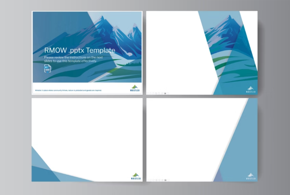
The Resort Municipality of Whistler needed a PowerPoint template that could serve multiple departments, meet varying presentation needs, and still reflect a unified, professional brand identity. The existing template was outdated, creating friction and reduced visual impact across the organization’s communications.
I took on the responsibility of designing and maintaining RMOW’s official PowerPoint template (.potx). My creative process began with a deep dive into the municipality’s vision statement and current Council priorities to ensure the visuals aligned with core values and strategic direction. This foundation resulted in a design that feels both purposeful and inspiring. To keep the design fresh and engaging, I implemented seasonal updates, rotating visual themes while strictly maintaining brand consistency through typography, color, and layout structure.
The updated templates have improved both the look and usability of internal and external presentations. They’ve made it easier for staff across departments to produce high-quality, on-brand materials with minimal effort, supporting clearer communication and a stronger municipal identity.
Custom Presentation Templates
Designing adaptable PowerPoint templates that elevate presentations while staying true to RMOW’s brand.
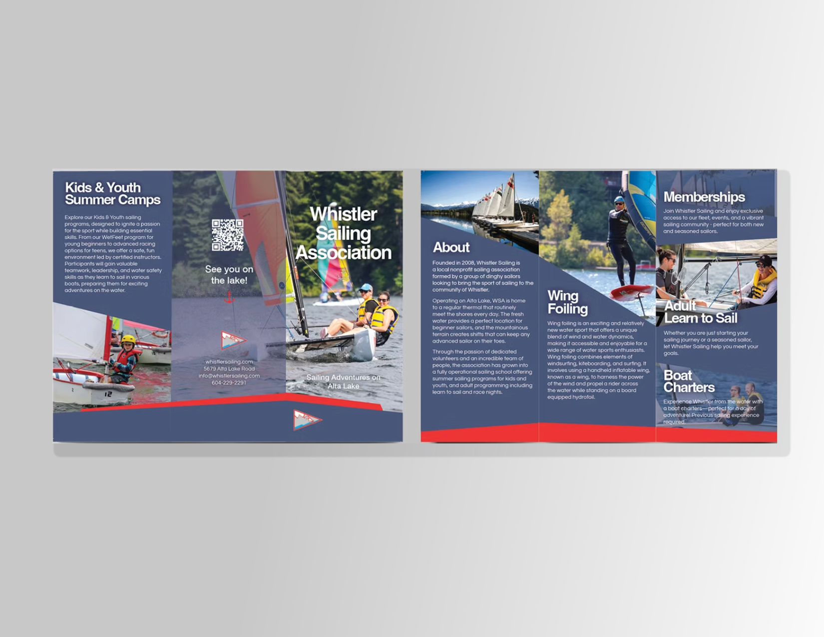
Every few years, Whistler Sailing undertakes a refresh of its print materials to align with new programs, evolving branding, and shifting audience needs. As part of this ongoing collaboration, I lead the design of promotional assets that support outreach to both locals and visitors—from first-time sailors to seasoned racers. The challenge is to create pieces that stand out in busy display environments, communicate information quickly, and stay true to the organization’s identity.
I design a variety of marketing collateral, including posters, brochures, and rack cards, each piece tailored to its message and audience. My process emphasizes high-impact visuals, strong typographic hierarchy, and clean, accessible layouts that guide the viewer through key content with ease.
These materials have been distributed across the Sea to Sky corridor in visitor centres, storefronts, and community hubs—boosting visibility and turnout for programs and events. Each design maintains brand consistency while allowing room for seasonal updates and evolving offerings.
Marketing Design
Creating impactful print designs that inform, attract, and resonate.
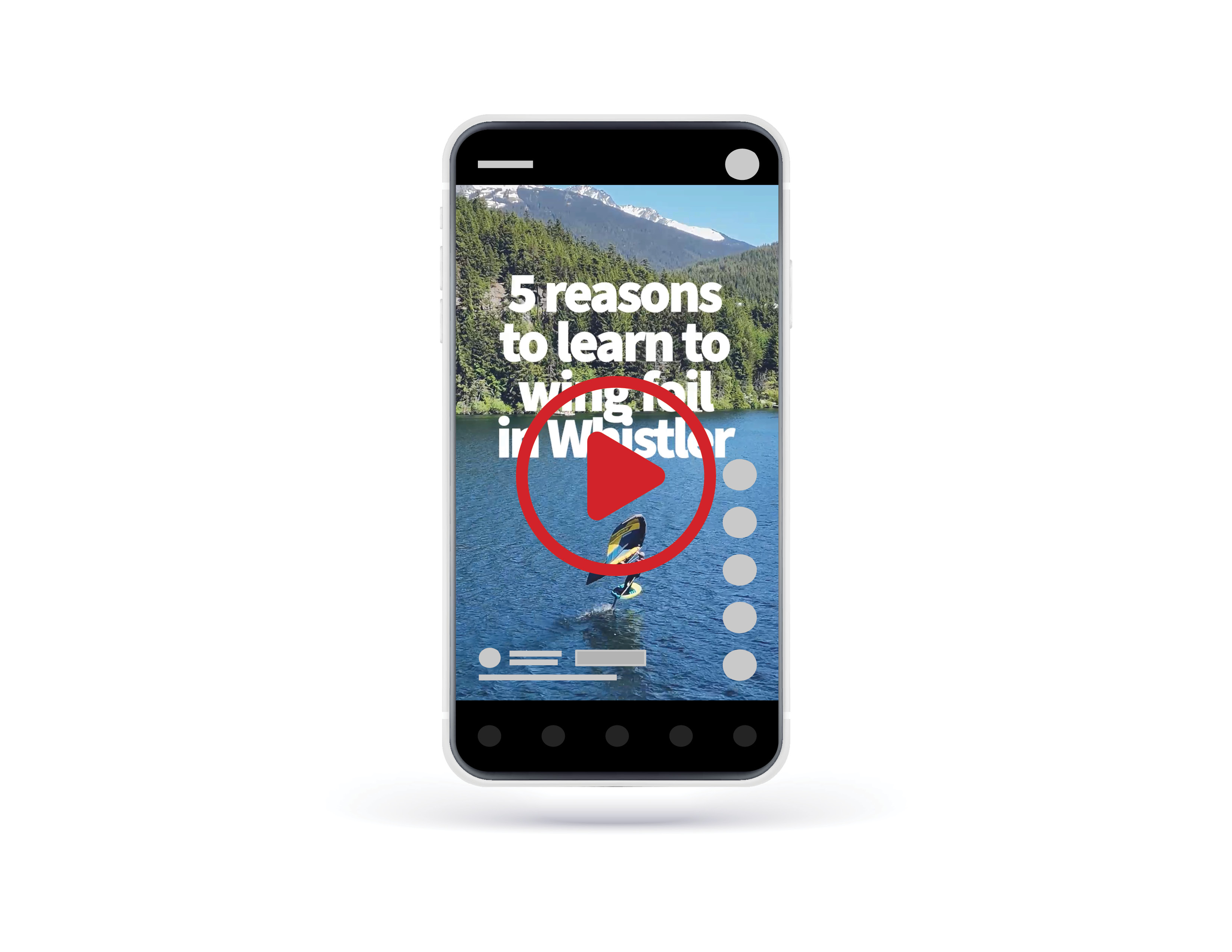
Whistler Sailing was launching a brand-new program: wing foiling. As an emerging sport with huge visual appeal but low local awareness, the goal was to quickly introduce it to the Sea to Sky audience and generate buzz. We needed a piece of content that could grab attention, communicate the thrill of the sport, and drive clicks.
I took the lead on editing and producing a high-energy reel tailored for mobile-first platforms. Drawing from on-water footage, I crafted a 60-second short that emphasized action, flow, and the stunning backdrop of Whistler’s landscape. Every choice—from pacing and transitions to soundtrack—was made to reflect the excitement of wing foiling while staying visually on-brand. I specifically selected clips that made the sport look inviting and achievable, steering away from anything that might feel intimidating to newcomers.
The video was launched with targeted social media ads across Instagram, Facebook, and YouTube. It quickly gained traction, generating early interest and giving Whistler Sailing a reusable visual asset to promote the program throughout the season—built to spark curiosity, clicks, and conversions.
I even got to jump in front of the lens for this one—you’ll spot me in the pink vest!
Video Editing
Creating dynamic short-form content that drives engagement.